Hi MFFL’s!! Nothing new in Mavs land; well, other than the current “teaser” that’s happening after a must win in Milwaukee tonight. We may find ourselves only 2 games out of the 8 seed at this time tomorrow. But much like a Dallas Cowboys 4th quarter comeback that results in a heartbreaking loss, don’t be deceived. Heck, maybe the Mavs can do it. Maybe I’m just being a negative Nancy. Who knows?
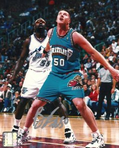
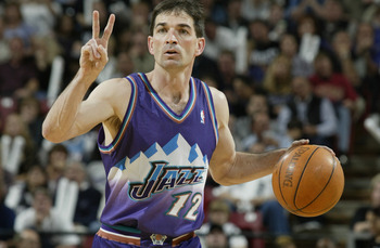
All that is certain is that this is America (queue screaming eagle sound effect). And because this is America, I have the freedom to write whatever I want. This is why I’ve chosen to breakdown the best and worst current NBA uniforms for you. I’ve always had an obsession with team’s uniforms (and team’s stadiums). I realize that most teams have done away with the atrocities that were the Vancouver Grizzlies, Toronto Raptors, and Utah Jazz uniforms from the 90’s***** and have gone to more simple and traditional looks. So my rankings will be tough given that most of today’s uniforms are “decent” compared to what they used to be. Also keep in mind, although I may despise a team, I may love their uniform. So this isn’t a ranking to be taken in terms of favorite teams, just favorite looks.
Today we’ll take a look at #30 – #20. Starting with worst NBA looks.
 #30. Minnesota Timberwolves: This is a classic case of “too much”. The font is all wrong although it is a tad better than what Kevin Garnett wore. In KG’s day, the word “Timberwolves” was stretched across the chest making it hard to read. The current jersey reads just “Wolves” but it still just doesn’t work. Possibly because the team’s colors and court decals are too close to the Mavs and Magic.
 #29. Charlotte Bobcats: Steal jersey fonts much? The font of the word “CATS” on Charlotte’s new uniforms is basically the same as the “DALLAS” font on the Mav’s jerseys. The new Charlotte uni’s also incorporate more Carolina blue…..for some reason….can’t imagine why. That’s cool, I guess. But I was a fan of the pinstripes they had on the uniforms before the new version came out. I always thought the uniforms were OK; it was just the logo that was brutal. Are there even many Bobcats in Carolina? I just googled it and yes, there are bobcats in North Carolina. Still doesn’t make the team name any less awful though.
 #28. Milwaukee Bucks: The Bucks uniforms are tricky. Home uniforms are clean, but the road uniforms with that dark green just don’t do it for me. And these alternates they’ve used this season with the big Buck on them……yikes. I can’t believe those ever made it out of the basement.
 #27. Atlanta Hawks: I’ll never understand why the Hawks did away with the red, gold, and black color combo. They really stepped outside the box with the Red/White/Blue combination (sarcasm for those scoring at home). The uniforms aren’t THAT bad, I admit. But the fact that they changed so radically is a bit bothersome. Plus, non uniform related, the court design is awful. What’s with the yellow-brown surrounding the court? I don’t get it.
 #26. Toronto Raptors: ANYTHING is better than what the Toronto franchise gave the NBA in their first few years. You remember the jerseys with the big cartoon velociraptor on it? Wow. The current uniforms are average now thanks to the removal of purple from the color scheme. I misspoke earlier when I hinted at the “Bobcats” being an awful mascot name. “Raptors” is a truly awful name. “Bobcats” has been promoted to “bad”.
 #25. New Orleans Hornets: Who knows what the final product will be for the New Orleans Pelicans new logo. But the current Hornets uniforms have their moments. The home whites are nice. But when the team goes to the alternate uniforms with the purple front and green back, I feel embarrassed for them.
 #24. Sacramento Kings: I’m a fan of the black and purple. The uniforms of the early 2000’s Kings are iconic. The new Kings font has been modernized but not to my liking. The alternate black jersey with the cursive “Kings” is a really good look in my opinion. But the half purple/half black “thing” they’ve been wearing on the road this year should never be worn again. Not sure how those were ever approved by team officials. Unless they just stopped caring once the Kings to Seattle talks got serious.
 #23. Oklahoma City Thunder: These uniforms are simple, but I just can’t get the road uniforms to grow on me. Trying to fit the entire “Oklahoma City” on the jersey just seems odd to me. The color scheme is too much as well. It’s like they have 12 different colors they try and incorporate into the uniform. Apparently they tried including the colors of the Sooners and OSU Cowboys. But there lies mistake number one; keep pro and college separate. OU and OSU get enough attention. But I am a fan of the alternate dark blue uniforms they’ve worn a few times this year.
 #22. Phoenix Suns: THIS JUST IN, Suns will be changing their uniform design in the 2013-2014 season. But we’ll focus on the current uniform for the sake of this ranking. I’ve always been indifferent on the Suns uniforms. The purple never really bothered me and the Suns uni’s of the Steve Nash tenure were always a good look to me. But I never really liked the “PHX” on the jersey. Something about it just didn’t sit well. As if they were trying to get too hip with their abbreviations. Same holds true with Atlanta, I dislike the “ATL” jersey. The alternate uniforms that the Suns wore vs. the Lakers this year (back with old logo) were awesome. I would love to see those get a rerun.
 #21. Utah Jazz: The Jazz uniforms of the late 90’s and early 2000’s were a laughing stock. Thank God for John Stockton and Karl Malone or that team may have been playing in a different town these days. Utah recently went back to the original font but with a green, yellow, and navy color scheme and a tribute to the 80’s team logo. I actually like it. But the fact that the state of Utah isn’t synonymous with “Jazz” just ruins it for me. So they get stuck with the #21 spot.
 #20. Houston Rockets: First, let’s take a moment to make fun of these Rockets uniforms from the Charles Barkley era. *** insert pic/link***. Haha, good times. The latest uniforms were introduced in the 2003-2004 season with the main red and white color scheme. In 2009, Rockets introduced gold numbers on the road uniforms which reflected back to the Rockets glory years. A move that I’m sure most Houston fans welcomed. The simple red and white on the home uniform is a bit plain in my opinion. It could use a splash of the gold as well.
Rankings #19 – #1 will revealed soon, so stay tuned. Or don’t. It’s your life. This is America. Do whatever you want.
But we’d prefer you stay tuned.
MFFL.
You must be logged in to post a comment Login
You must log in to post a comment.